2020 Colors of the Year

pantone-color-of-the-year.jpg

Pantone’s COTY: Classic Blue

This year’s Pantone color has been unveiled: the bold yet calming Classic Blue. You’ll see it in fabrics, furniture, clothes, shoes, and more. In fact, you probably already have! Painting an entire room this rich color might be a little overwhelming but using it as an accent brings a lively, timeless pop of color into any space. Blue has always been a frontrunner in interior design. It is a calming, happy, and safe color.

first+light+%282%29.jpg

Benjamin Moore’s COTY: First Light

Soft and and serene, First Light can be used in a whole room or as an accent color. It really suits a master bedroom, a small child’s room, or even a nursery.  In between pink and peach, we would call this color blush.

Sherwin Williams, PPG, and HGTV all coined similar pinks and blues as their Colors of the Year. The great thing about these colors? These pinks and blues work spectacularly together. Different variations of the colors bring different expression – some pairings are more serene while some are more lively.  

Get to Know Barbee

Barbee’s backyard at sunset in Boulder, Colorado.

Barbee’s backyard at sunset in Boulder, Colorado.

Want to know more about the woman behind the design magic? Read this fun Q & A.

Q. If you weren’t a designer what would you be?
A. I would be a school teacher.

What’s the first thing you do in the morning?
A. Usually, I start up the coffee pot, let the dog out, have 2 cups of coffee, and read the newspaper.

Q. What’s number one on your bucket list right now?
A. I want to go on a photo safari in Africa.

Q. What’s on your nightstand?
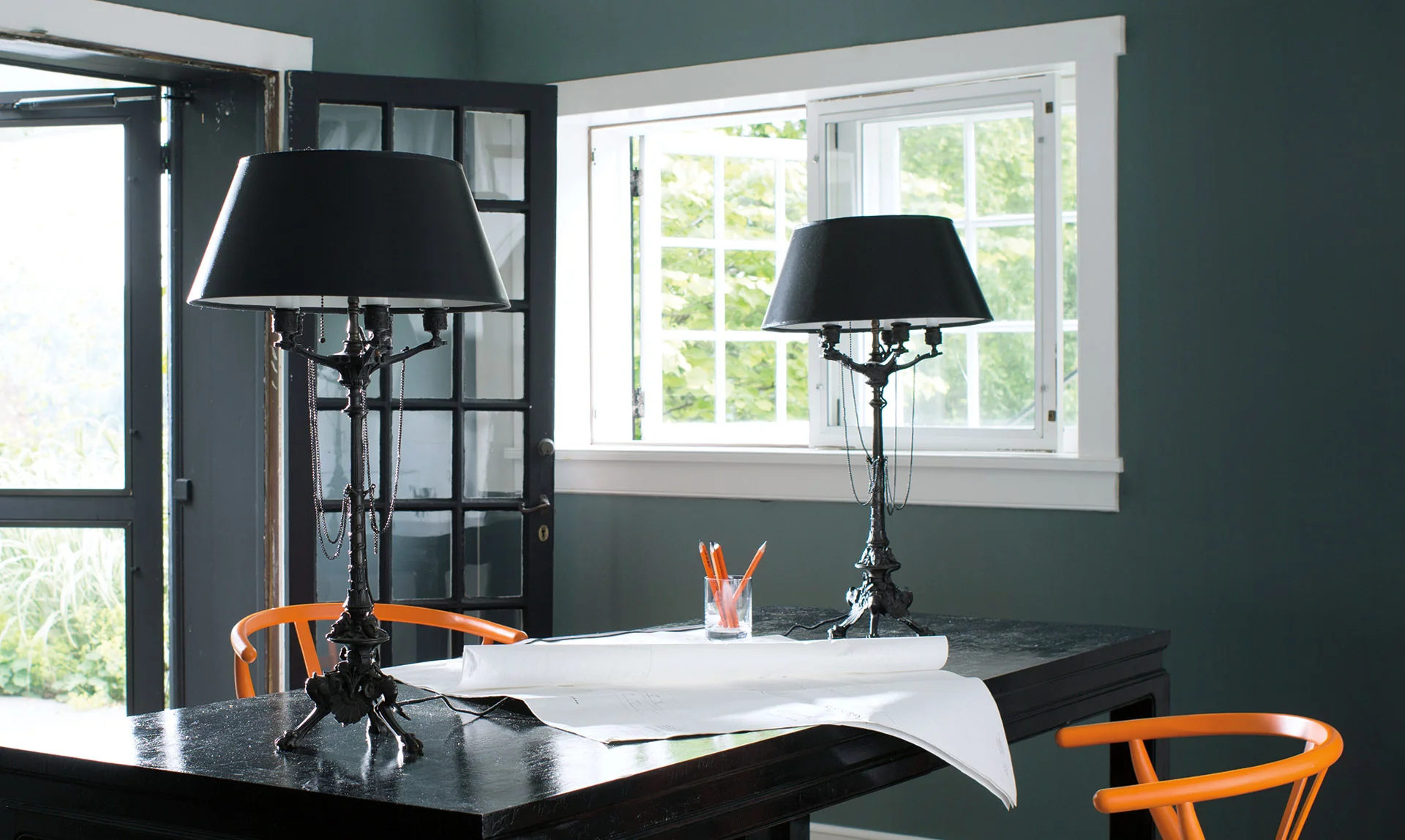
A. Right now I have a water glass, an alarm clock I’ve had for 40 years, a glass lamp, and a lot more medical stuff because I just got my knee replaced.

Q. What are the three things you do before company arrives?
A. I tidy things up a bit, I cook, and I shower. I have people in and out of my house all of the time, everyone is welcome, so getting the house ready isn’t a big thing for me.

Q. What’s your favorite drink of choice?
A. Dos Equis Amber.

Q. Favorite vacation destination?
A. Tulum, Mexico. Tulum has the best beach in the world.

Q. Describe your aesthetic in three words.
A. Eclectic. Whimsical. Elegant.

Q. Design rules: one to break? one to always follow?
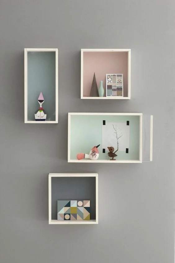
A. In hanging art on walls, design school taught me you should have a matching frame, matching matte, or matching content. Throw that out. It’s all changed. As far as one to follow: don’t do trendy.

Q. Favorite color combo?
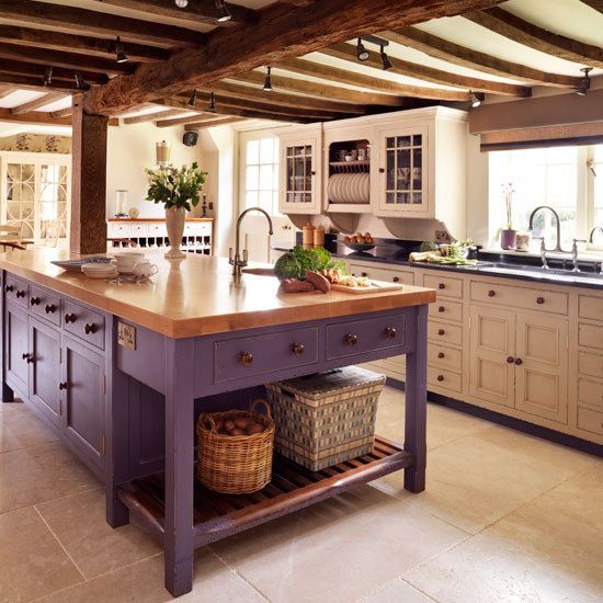
A. I like natural colors, including the teals of the oceans, the oranges of the skies and the sunset, the neutrals of the sand, and the mosses of rocks.

Q. Which celebrity’s house would you love to get your hands on?
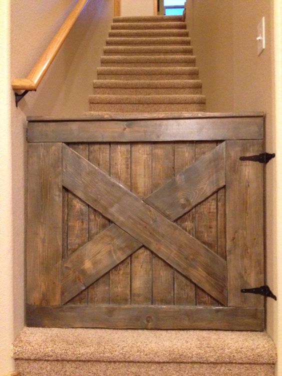
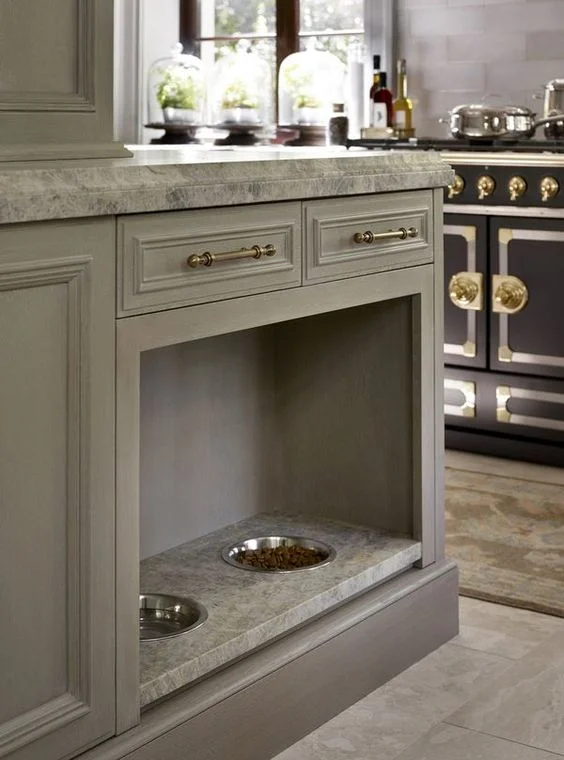
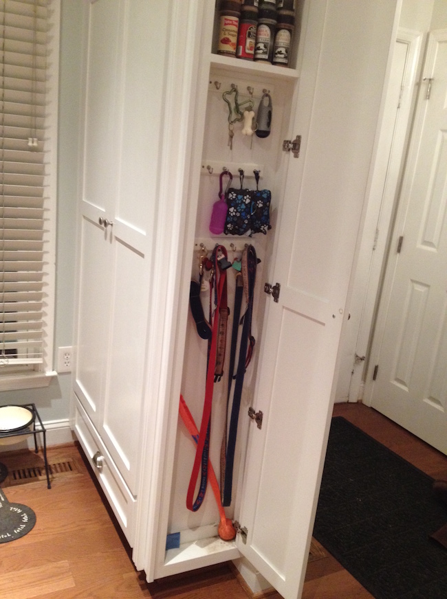
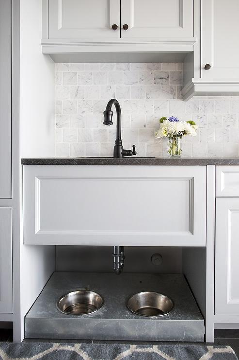
A. The late Doris Day. She would need a wonderful dog-friendly house. She has a hotel in Carmel that is all full of dogs! The city council actually approved the entire city of Carmel to be dog friendly.

Q. Share one tip for someone looking to bus out of a style rut.
A. Look for things that bring you joy and put them into your home or work environment.

Q. Is there a trend you would love to try, but haven’t been able to talk a client into yet?
A. Truthfully, I’m not very trendy!

Q. What made you go into the interior design field and what keeps you there?
A. When I was a kid, I knew I was going to do something with space or design. It was just what came naturally to me. My mother would come into my room in the morning and I would have rearranged my room again. I would pull the furniture across the floor myself. A far as what keeps me here, I do love seeing the finished product.

Q. What the best design advice you’ve ever been given?
A. Well, the best design advice I’ve been given for working with clients is that you must listen to what they want, but you also must look around and observe. You have to look at their environment just as much as you listen to them.

Q. What’s something about you that many clients don’t know?
A. I am extremely dyslexic. I use a mouse upside down. (Really!).

Q. What’s the most treasured piece in your home?
A. If my house was going to be burnt down, I’d take the lamp in my living room. It’s an old crystal kerosene lamp that was threaded into an electric lamp. My ancestors passed it down to me.

Q. Which designer do you admire most?
A. Frank Lloyd Wright.

Q. Quote to live by?
A. Leave everything better than you find it.

Q. What is a trend that you think will be going out of style?
A. I think grey is going to be a short lived color.

Q. Tell me about your first client?
A. My first project was my design school graduation project was a medical center. I designed lobbies and doctors’ offices . It was pre-computer, so everything was hand drawn. The project was full of commercial fabrics and wall coverings (there were lots of wallpaper back then!). This was over 40 years ago.

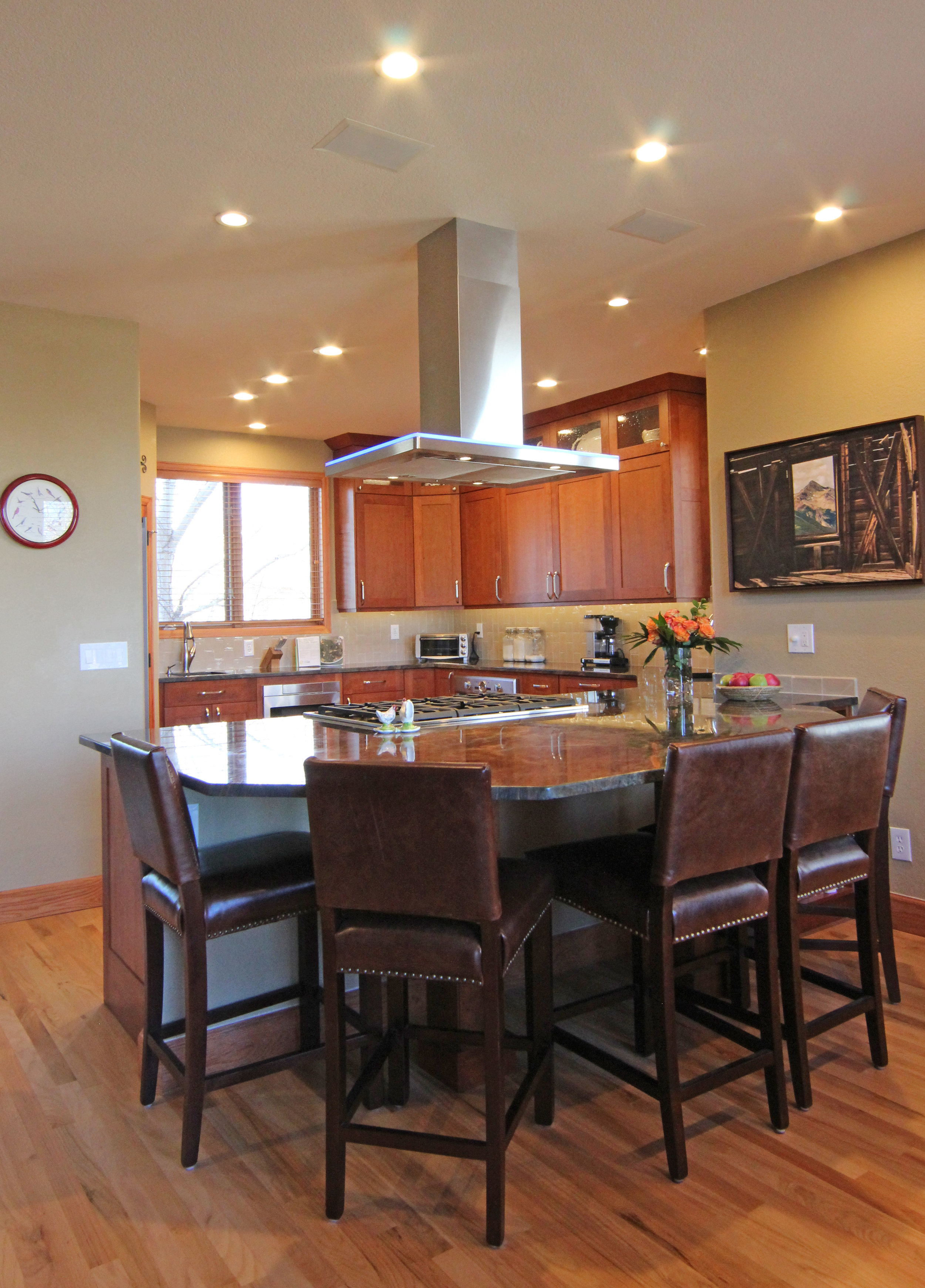
Q. Where do you go for inspiration when you’re feeling stumped?
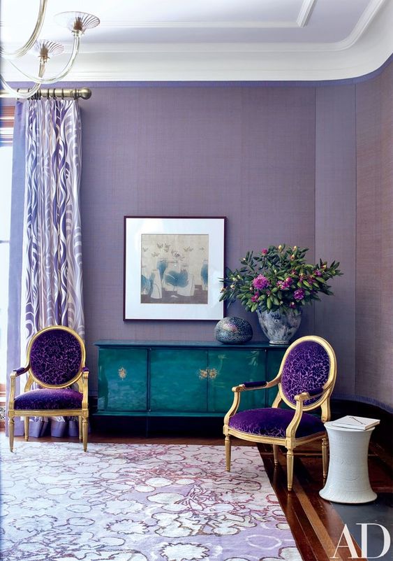
A. My inspiration and my sanctuary space is my backyard. Sitting out there usually does the trick. (Picture above!)

Q. What are common mistakes that you see in client’s homes?
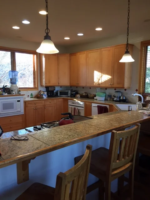
A. I’d say there are three common mistakes. 1. People hang their pictures too high. 2. They don’t pay attention to function. They don’t have lamps in the right places to serve the function of the space. 3. Replacing things out of order. For instance, they’ll put new counter tops on older cabinets that don’t have expected modifications (like dovetail full extension soft close drawers) that they’ll want to replace later. Then you have to replace the counter top again.


2018 Color of the Year

1c115e69676fa4e7fd3eec8ed483b110.jpg

The new Pantone color of the year, Ultra-Violet 18-3838, is bold, rich, and vibrant. However, sometimes color can intimidate clients, especially color that is bold. The perfect place to experiment with color can often be in pillows, art, and accessories because these items can be easily moved around the home. Another fun way to incorporate color can also be in small spaces like accent tile for your bathroom, kitchen islands, and accent walls in bedrooms.

Color can have an amazing effect on your mood. Ultra-Violet is a color that is highly intuitive and encourages deeper thinking which makes it a wonderful color to incorporate into a yoga room or meditation space.

"Historically, there has been a mystical or spiritual quality attached to Ultra Violet. The color is often associated with mindfulness practices, which offer a higher ground to those seeking refuge from today’s over-stimulated world. The use of purple-toned lighting in meditation spaces and other gathering places energizes the communities that gather there and inspire connection." - Pantone

We would love to help you incorporate this magical color into your home so you too can reflect a little longer, think a little deeper, and be inspired in 2018!

Images via Pinterest


2017 Color Trend: Holistic

One of the easiest ways to transform a home is by updating color. Not only do we love to help our clients find the perfect colors for their home but we also love to stay informed with current color trends. Last year we learned that warm neutrals were taking reign and this year it looks like we are taking that a step further and colors are trending back to the 50's for inspiration. We are seeing pastels coming back in not just paint but also furnishings.

One of our favorite color forecasting tools is provided to us through Sherwin Williams Color Mix. This is their synopsis of the general color zeitgeist for 2017: "The state of color has never been more restless. New spirituality, cultural flux, feisty self-expression and soulful nostalgia are combining to paint an emerging portrait of our shared future". 

Details wanted to share our favorite of the four Sherwin Williams predicted color pallets for 2017 which is called "holistic". This pallet perfectly combines trendy pastel colors with earthy hues and rich saturated accent colors to give you a warm, inviting space. For this particular pallet, they were heavily influenced by experiential travel/retreats, social consciousness, feeling comforted, and the human instinct to be in nature. People are starting to only purchase sustainable, fair trade goods as a new normal.  Material & print trends that coincide with this color pallet include; geometric shapes, minimalist clean lines mixed with exaggerated round shapes, watercolor prints, rust & oxidized patinas, botany prints, and raw woven materials. 

The Holistic Pallet

via: https://www.sherwin-williams.com/architects-specifiers-designers/color/color-forecast/2017-color-forecast/holistic

via: https://www.sherwin-williams.com/architects-specifiers-designers/color/color-forecast/2017-color-forecast/holistic


Below are some additional color forecasts that align with the holistic pallet as well as inspiration to go along with this prediction. Hope it inspires you!

via: http://ideas.kohler.com/mood-board/flight-of-fancy-bathroom

via: http://ideas.kohler.com/mood-board/flight-of-fancy-bathroom

via: http://ideas.kohler.com/mood-board/hollywood-kitchen

via: http://ideas.kohler.com/mood-board/hollywood-kitchen

via: https://www.ppgvoiceofcolor.com/

via: https://www.ppgvoiceofcolor.com/

via: https://www.pinterest.com/pin/AXKCCpr5jnd4VA6voXdFpXXLHEGLwqLuObQCKzy5cXaagz3K4dg5Hns/

via: https://www.pinterest.com/pin/AXKCCpr5jnd4VA6voXdFpXXLHEGLwqLuObQCKzy5cXaagz3K4dg5Hns/

via: https://www.pinterest.com/pin/226939268701459931/

via: https://www.pinterest.com/pin/226939268701459931/

via: https://www.pinterest.com/pin/226939268702511903/

via: https://www.pinterest.com/pin/226939268702511903/

via: https://www.pinterest.com/pin/226939268702511897/

via: https://www.pinterest.com/pin/226939268702511897/

via: https://www.benjaminmoore.com/en-us/color-overview/color-collections/color-trends-2017

via: https://www.benjaminmoore.com/en-us/color-overview/color-collections/color-trends-2017

via: https://www.benjaminmoore.com/en-us/color-overview/color-collections/color-trends-2017

via: https://www.benjaminmoore.com/en-us/color-overview/color-collections/color-trends-2017

via: https://www.benjaminmoore.com/en-us/color-overview/color-collections/color-trends-2017

via: https://www.benjaminmoore.com/en-us/color-overview/color-collections/color-trends-2017

via: https://www.pinterest.com/pin/ATiw6IP99h0ZEzZ7qMRC7GG8kQDoGRkWiQpj3Bus-vKOE8q6-rFl7Ho/

via: https://www.pinterest.com/pin/ATiw6IP99h0ZEzZ7qMRC7GG8kQDoGRkWiQpj3Bus-vKOE8q6-rFl7Ho/

via: https://www.benjaminmoore.com/en-us/color-overview/color-collections/color-trends-2017

via: https://www.benjaminmoore.com/en-us/color-overview/color-collections/color-trends-2017

via: https://www.benjaminmoore.com/en-us/color-overview/color-collections/color-trends-2017

via: https://www.benjaminmoore.com/en-us/color-overview/color-collections/color-trends-2017

via: https://www.pinterest.com/pin/AfrBoNqhFQMq_il0HtkjbxVHEa7RePasXdt_rzlMfLVV2dSgLTO6mxE/

via: https://www.pinterest.com/pin/AfrBoNqhFQMq_il0HtkjbxVHEa7RePasXdt_rzlMfLVV2dSgLTO6mxE/

via: https://www.pinterest.com/pin/226939268700493300/

via: https://www.pinterest.com/pin/226939268700493300/

via: https://www.pinterest.com/pin/226939268701459920/

via: https://www.pinterest.com/pin/226939268701459920/

via: https://www.pinterest.com/pin/226939268701383245/

via: https://www.pinterest.com/pin/226939268701383245/

via: https://www.pinterest.com/pin/226939268700669265/

via: https://www.pinterest.com/pin/226939268700669265/

via: https://www.pinterest.com/pin/366410119666369163/

via: https://www.pinterest.com/pin/366410119666369163/

via: https://www.pinterest.com/pin/562950022156346806/

via: https://www.pinterest.com/pin/562950022156346806/

Check out more inspiration on our Pinterest

https://www.pinterest.com/detailsboulder

Designing for the Pampered Pet

Because our design studio is rooted in Boulder, CO, we work with lots of pet loving clients. We have designed window seats for sunbathing pets, carpeted dog ramps and custom pet beds just to name a few. 

Recently Details attended "Unleashed Pet Designs" to further our education on designing homes to fit the needs of pet owners. After this event, Details became inspired to share some of these fun ideas with you! 

So let's start with some key things to consider when furnishing your home for pets. Firstly, you want to make sure your valued items stay in great shape and are protected from the unexpected occurrences. We highly recommend getting your sofas, chairs, and rugs treated with a sealant. We can personally attest to the value of getting this done in order to be ready for the unexpected moment when your dog eats a chocolate bar.

Another way to make sure that you have a low-maintenance, pet-friendly space is by either purchasing furnishings with pre-treated fabrics that include Crypton technology or reupholstering them with high-performance fabrics. Yes, these fabrics will be more expensive upfront but they will last longer over time. For a lower priced option, we recommend a high-quality micro-suede fabric for furniture items. 

There are also some great built-in ways to create a functional home for you & your pets. A few of my favorite ideas include pot-fillers for the water dishes, roll-out trash bins to house pet food, built-in pet food dishes within the kitchen, dog wash stations, and even a dog-crate kitchen island (see pictures below)!

Hopefully some of the ideas we have suggested will help you in decorating and building for your pets! - DDS

Before & After Lafayette Kitchen Remodel

This past fall we were able to work with a family in Lafayette, CO to help them create their dream kitchen. Our client wanted to create a chef's kitchen that would not only feel expansive and updated but would serve as a gathering place for friends and family. Below you can see a picture of the before kitchen. It was still in very good shape but just needed some updating.

When updating a kitchen, we look into a few different things to make sure our client is selecting the right materials for their lifestyle. For instance, if you want a low maintenance cabinet, wood is the best option because it doesn't show scuffs & denting as much as a painted cabinet.

Another thing that stands out about this before picture is the 12x12 countertop. This dates the kitchen but also creates more cleaning for the client (all those grout lines). The last thing we want is for our client to be cleaning rather than enjoying their space.

Lastly, the backsplash tile is also in great shape like the rest of the kitchen but it too dates the home with the diamond pattern so we choose to upgrade this as well during the renovation.

Another part of our proposed kitchen plan was the removal of the kitchen nook table and expansion of the countertop to create a built-in eating area. Our client was a little hesitant about losing the nook table but now the built-in eating area is one of their favorite gathering places. We pulled some inspiration from Houzz to help assist our client in seeing the benefit of the large peninsula counter space for dining (links below).

http://www.houzz.com/photos/5685389/Minnesota-Residence-traditional-kitchen-minneapolis

http://www.houzz.com/photos/2318905/Kitchen-contemporary-kitchen-san-francisco

http://www.houzz.com/photos/3317777/Crocus-Hill-Kitchen-craftsman-kitchen-minneapolis

So after some back and forth on the kitchen layout, we finally got a plan that everyone was on board with and hit the ground running to find the perfect materials for the space. After a visit to the Schroll Cabinet showroom in Denver, our client found some inspiration from the craftsman style kitchen on Schroll's website (http://schrollcabinets.com/inspiration/kitchen-34/). 

After the cabinet color & style was selected, Details took our client to The Stone Collection in Denver to start looking at slabs. Our client ended up falling in love with this fusion granite (pictured above) for their kitchen counter-top.

"Fusion granite is an incredibly complex granite that combines a variety of blues, whites, grays and browns to create a truly marvelous stone. It is quarried in Brazil and is occasionally called blue fire granite. As the name suggests this stone is a real “fusion” of color" (source: http://patscolor.com/materials/granite/fusion-granite/).

What we ended up learning about this granite is that because it has so much movement it is more fragile and so we had to make sure that we planned for sturdy supports in the areas where the countertop would overhang at the seating area planned. To do this we commissioned our metal worker to make a large metal plate to fit underneath the island area and we also had our cabinet installer make two large support beams for this area as well.

As you can see from the pictures in the slideshow below, the new cabinets went full height to the ceiling with crown molding and the upper cabinets have beautiful seeded glass inserts. We also added under cabinet lighting to the kitchen cabinetry as well. The new backsplash tile is a hand-done subway tile in a vertical pattern.

All of these upgrades dramatically increased the value of our client's home but also made our client's dreams of an upgraded chef's kitchen a reality and we were so glad to be part of the transformation!

- DDS